Nature in Black and White
by Elenor Ling
“Did people see only in black and white in the old days?” I remember asking my amused parents as a child (or words to that effect), while watching a video of a pre-technicolour Hollywood film. Child logic can be funny: live TV was in colour, and if it hadn’t always been that way, the reason must be because the camera recorded exactly as people saw, without colour. (Yes, I’d seen a painting, but linear time has no meaning for children - adults spoke about films being old, but not art. If I’d been asked if the Hollywood production was older than a painting in colour of any century, I’m sure I would have got it wrong).
There would have been a degree of pity to accompany my question, as the childish reasoning implies. Colour is better, surely? You wouldn’t choose to work in black and white unless you had to? As it happens, working in monochrome is plenty of artists’ first choice, and is incredibly useful for those who do normally work in colour. In 1892, Pre-Raphaelite painter John Everett Millais was interviewed about his practice:
“I have my pictures photographed in platinotype [a process patented in 1873] when almost completed, and I correct with chalks any mistakes I see in the photograph, where they are far more flagrant in the black and white than they would be in the original” – John Everett Millais, ‘Answers’ magazine, 18 June 1892
Being able to see his canvases in shades of grey, without the distraction of other hues, helped Millais judge the dispersal and range of tone.

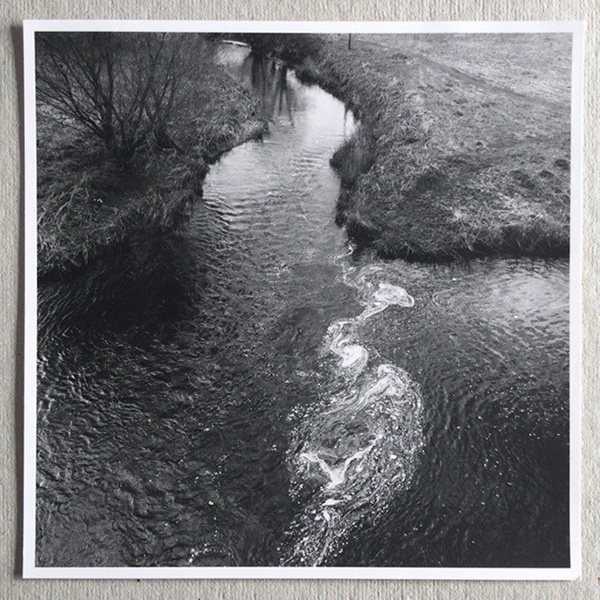
– ‘Where Blackadder Water meets Whiteadder Water’, by Graham Murrell, made for the exhibition ‘Confluence’ as guest artist at Pauline Burbidge and Charlie Poulsen’s annual exhibition in Berwickshire, by kind permission.
Photography was once described as ‘the pursuit of the infinite grey,’ Graham Murrell informed me during a recent conversation. Graham is an acclaimed photographer who taught at Central St Martins, and works only in black and white. Digging further into his motivation, he volunteered that it was partly about pacing the impact of the composition:
“colour is likely to tell too much too soon. An old adage that we used to peddle to the students was ‘the photograph should not reveal itself in its entirety to the first glance’.”
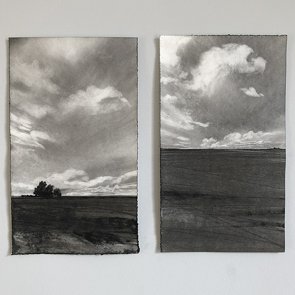
Artist Kate Boucher, who joined us on Walk B, worked exclusively in charcoal during her Fine Art MA degree at West Dean College, and afterwards considered moving back into colour:
“When I went on a residency, I took both pastel and charcoal, and I realised that one wasn’t better than the other, it was different. The relief of stepping back into the comfort of charcoal was very strong. Not because it was easier, but because it said what I wanted, communicated my emotions around the landscape much better.”

– Two works by Kate Boucher, by kind permission
Kate and Graham here are in accord: for Graham, ’monochrome offers the viewer more opportunity for interpretation. It provides more space for an emotional reaction triggered by memory, nostalgia and individual circumstance.’ In her drawn monochrome landscapes the emotional response Kate Boucher aims to elicit in the viewer is one that plays on tensions between the known and the sensed, the perceived and the remembered.
So much of these considerations resonate with John Constable and his English Landscape series. Constable did not have the use of photographic processes, nor did he have the option of printing in colour. But the monochrome mezzotints do brilliantly capture dispersal of tone and Constable was adamant that landscape could give rise to emotional responses. Constable even subtitled the series, ‘Chiaroscuro of Nature’ (‘chiaro’ and ‘scuro’ are Italian for ‘light’ and ‘dark’), and he meant it as much metaphorically as materially. My childhood self would have been surprised at how many possibilities are opened up, not shut down, by black and white.
